Thank you for visiting my site!
PROJECT DETAIL
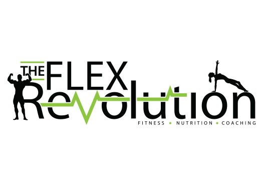
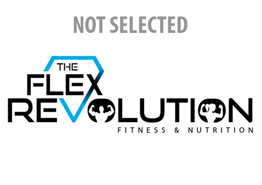
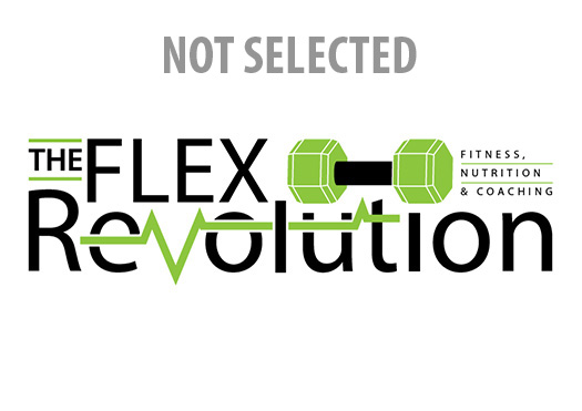
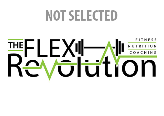
This logo was designed for a husband and wife team that ran a health and fitness business. We worked through a number of methods to depict both the masculine and feminine as well as non-descriptive versions. They ultimately sided with some simple silhouettes.
I also consulted with them on the business name, which initially took on a very strong military persona tied to the Bomb Squad, or E.O.D. as it is called. Knowing they would eventually transition from a military community I worked with them on a more fitness minded brand that would speak to the community as a whole, and not just in relation to the military.
 Project Management
Branding
Single Misc Ad
Other: Magazine Ads
Single Page Printouts/Flyers
This project was created using the methods, software and skills below:
Plain old drawing, a light-box and some tracing paper to refine doodles.
Adobe Illustrator, Photoshop,